Learn how to configure targeting, settings, and follow best practices to maximize tour effectiveness and user engagement.
Configuring your tour steps properly ensures users have a smooth, engaging experience. Each step has three configuration tabs - Behavior, Styling, and Advanced - that let you customize every aspect of the tour experience.
Understanding step configuration
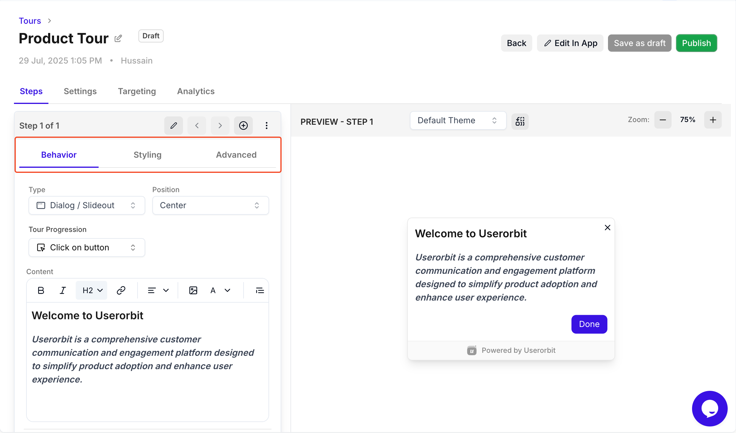
When you create or edit a tour step, you'll find three main configuration tabs:
Behavior: Controls step type, position, and progression
Styling: Customizes buttons, colors, and visual appearance
Advanced: Sets page URLs, delays, and special behaviors
Behavior tab settings
The Behavior tab controls how your tour step appears and how users interact with it.
Step type selection
Dialog/Slideout: Modal or side panel for full attention. Best for onboarding, announcements, detailed explanations.
Pointer/Tooltip: Contextual tooltip attached to specific elements. Perfect for feature discovery and quick tips.
Banner: Top or bottom bar for non-intrusive announcements. Ideal for persistent reminders.
See our guide on understanding tour types for detailed comparisons.
Position settings
Dialog/Slideout positions:
Center (default) - Full modal in the middle
Bottom-right, Bottom-left - Slideout panels
Top-right, Top-left - Corner slideouts
Banner positions:
Top - Most visible
Bottom - Less intrusive
Pointer/Tooltip positioning:
Auto (recommended) - Smart positioning
Top, Bottom, Left, Right - Manual placement
Best practice: Use "Auto" for pointers and "Center" for critical dialogs.
Tour progression
Click on button (Default): Users click "Next" to proceed. Best for guided step-by-step tours.
Click on element: Requires clicking the highlighted element before advancing. Perfect for hands-on practice and interactive tutorials.
When to use Click on Element
Ideal for:
Interactive onboarding: Make users practice clicking actual buttons
Feature adoption: Ensure users know where to find features
Skill building: Teach workflows through actual actions
Verification: Confirm users understand before moving forward
Best practice: Don't overuse - mix with "Click on button" for balanced experience.
Tooltip/Pointer side positioning
Available positions: Bottom, Top, Left, Right, Auto
Best practice: Start with "Auto" and only override if you see positioning issues.
Content justification (Banner tours only)
Available options:
Justify Between: Content spreads, message left, CTA right (most common)
Left: All content left-aligned, simple announcements
Right: All content right-aligned (rare)
Justify Around/Evenly: Balanced, centered feel
Floating mode
Enable to make tour step "float" and follow scroll position.
When to use: Long pages where users might scroll, important information that should stay visible
When NOT to use: Short pages, modal dialogs, mobile experiences
Full-size CTA option
Make primary button expand to full width for maximum visibility.
Enable when: Single critical action, mobile users need larger tap target, button text is long
Best practice: Only use for most important action per step.
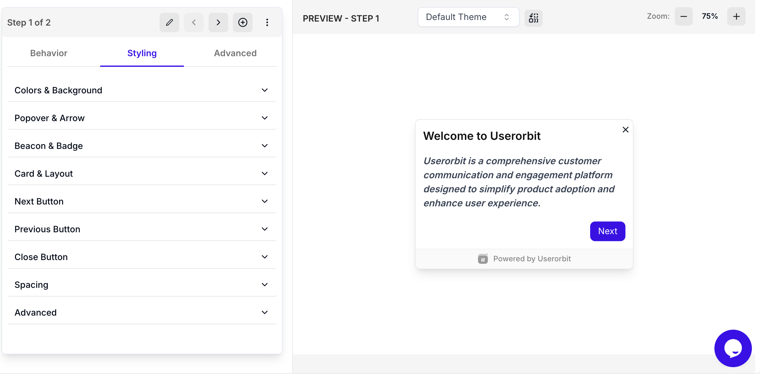
Styling tab settings
Colors & Background
Customize overall look: background color, primary/secondary text colors, overlay color and opacity
Popover & Arrow
For pointer/tooltip tours: arrow visibility, style, and image
Beacon & Badge
Customize attention-grabbing elements: badge background/text colors, border radius, beacon background
Card & Layout
Control card appearance: width, border color/width/radius, box shadow intensity
Button Styling
Customize all buttons (Next, Previous, Close): background/hover colors, text color, border radius, shadow
Spacing
Fine-tune internal spacing: padding (top, right, bottom, left), footer padding
Advanced
Additional customization: custom CSS, font family overrides, z-index controls, animation settings
Best practice: Maintain consistency across tours by using same styling settings or applying theme globally.
Advanced tab settings
URL patterns
Control which pages display each step.
URL match types:
Exact match:
https://app.example.com/dashboardContains/Path:
/dashboardPattern:
/projects/:projectId/overview
Best practices: Use path-based rules, keep patterns specific, test on staging first
Step-level URL patterns
Each step can have its own URL pattern for multi-page tours.
How it works:
Tour-level URL: Where tour can START
Step-level URL: Where each individual step appears
Example multi-page tour:
Tour-level URL:
/dashboard(tour starts here)Step 1 URL:
/dashboard(welcome message)Step 2 URL:
/projects(navigate to projects page)Step 3 URL:
/projects/new(show create project form)
Best practices:
Use path-based matching (more reliable than exact URLs)
Test URL patterns thoroughly before publishing
Avoid overly broad patterns that match unintended pages
Auto-proceed with timer
Automatically advance to next step after specified delay.
Recommended timing:
Short steps: 5-7 seconds
Medium steps: 10-15 seconds
Long steps: 15-20 seconds
Video content: Match video duration + 2 seconds
Show proceed bar: Always enable to display visual countdown
Best practices:
Use for product demos and showcase tours
Give users enough time to read comfortably
Always show proceed bar when auto-advancing
Don't use for critical onboarding or steps requiring user input
Closable settings
Allow users to close: Enable/disable the X button
Best practice: Always allow closing unless it's critical onboarding. Don't trap users.
Delay before showing step
Add delay before step appears. Crucial for dynamic content that loads after page renders.
Recommended delays:
Static content: 0-300ms
Dynamic content: 500-1000ms
After page transitions: 600-800ms
API-loaded content: 1-2 seconds
Heavy pages: 1-1.5 seconds
Best practices:
Start with longer delay and reduce if feels slow
Test on slower connections
Combine with "Wait for element" for reliability
Wait for element (Pointer/Tooltip tours)
Delays showing tooltip until target element actually exists in DOM.
When to enable:
Elements loaded by JavaScript, API calls, lazy-loaded content, tabs/modals, search results
Not needed for static HTML elements present on page load
Best practices:
Always combine with appropriate delay settings
Use stable CSS selectors (IDs, data attributes)
Test on slow connections
Set reasonable timeout
Step count display
Show step count: Display "Step 1 of 5" to set user expectations and show progress.
Best practice: Always show for multi-step tours (3+ steps). Increases completion rates by 20-30%.
Progress bar display
Show visual progress indicator across all steps.
Best for: Long tours (5+ steps), visual learners, mobile experiences
Can be combined with: Step count for maximum clarity
Custom hint text
Add supplementary helpful text below main step content for tips, warnings, or contextual information.
Use cases:
Tips and shortcuts: "Press 'K' to quickly open the command palette"
Warnings: "This action cannot be undone"
Additional context: "This feature is only available on the Pro plan"
Time estimates: "This process usually takes 2-3 minutes"
Best practices: Keep brief (one sentence), use emoji for visual interest, don't duplicate main content
Complete configuration checklist
Behavior tab checklist
Step type selected appropriately (dialog/pointer/banner)
Position set correctly (auto for pointers, center for modals)
Progression mode chosen (button click vs element click)
Tooltip side configured if using pointer
Content justification set for banners
Floating mode enabled only if needed
Full-size CTA enabled for primary actions if beneficial
Advanced tab checklist
Step URL pattern matches target page(s)
URL matching tested on staging/production
Delay set appropriately for content load time
Wait for element enabled for dynamic content (pointers)
Auto-proceed configured with appropriate timing
Show proceed bar enabled if using auto-proceed
Step count displayed for multi-step tours (3+ steps)
Progress bar shown if tour is long (5+ steps)
Custom hint text added for helpful context
Closable enabled (unless absolutely critical)
Testing checklist
Preview tour on desktop, mobile, tablet
Test on different browsers (Chrome, Firefox, Safari)
Verify URL matching on all target pages
Test progression (both button and element click if used)
Check timing of delays and auto-proceed
Verify tooltip positioning on all screen sizes
Test "wait for element" reliability
Ensure buttons are visible and clickable
Verify close button works
Preview tour testing
Step appearance: Appears on correct pages, timing feels natural, position works on all screen sizes
Buttons and progression: All buttons function, progression logic flows smoothly, navigation seamless
Delays and timing: Appropriate for content load, auto-proceed timing comfortable, proceed bar displays correctly
URL matching: Steps appear on correct pages, multi-page transitions work smoothly, pattern matching accurate
Mobile experience: Touch targets large enough, content fits on small screens, tooltips don't go off-screen
Common mistakes to avoid
Too many steps without progress indication: Always show step count for 3+ step tours
No exit option: Enable close button unless absolutely critical
Delays too long: Use minimum necessary (300-600ms typically)
Generic button text: Customize to match context ("Done" not "Next" on final step)
URL matching too broad: Make patterns specific to avoid unintended triggering
Forgetting "wait for element": Always enable for dynamic content
Auto-proceed too fast: Give users enough time to read (5 seconds minimum)
No proceed bar with auto-proceed: Always show visual countdown
Full-size CTA overuse: Only use for most important action
Wrong tooltip side: Test positioning - auto is usually best
Floating mode on mobile: Can block content, test thoroughly
Best practices summary
General configuration
Choose appropriate step types for each message
Enable close buttons unless critical - don't trap users
Show step count for multi-step tours (3+ steps)
Show progress bar for long tours (5+ steps)
Keep tours short (3-5 steps ideal)
Timing and delays
Use minimal delays (300-600ms for most cases)
Always enable "wait for element" for pointers on dynamic content
If using auto-proceed, give adequate time (minimum 5 seconds)
Always show proceed bar when using auto-proceed
Progression and interaction
Use "click on button" for most cases, "click on element" sparingly
Test element click progression thoroughly
Customize button text to match context
Use full-size CTA only for primary actions
Positioning and display
Use "auto" tooltip positioning unless specific reason not to
Test tooltip positioning on mobile and tablet
Use floating mode cautiously
For banners, choose content justification that matches your design
URL and targeting
Test URL matching thoroughly on all intended pages
Use path-based patterns over exact URLs for flexibility
Set step-level URLs for multi-page tours
Make URL patterns specific enough
User experience
Add custom hint text for helpful tips and context
Show progress indicators (step count + progress bar)
Don't auto-proceed on steps requiring user action
Test complete tour flow before publishing
Troubleshooting
Step visibility issues
Step doesn't appear:
Check URL matching pattern (most common issue)
Ensure tour is published
Verify targeting rules
Check browser console for errors
Pointer tooltip in wrong position:
Check CSS selector is correct
Enable "wait for element"
Try "auto" positioning
Check if element is hidden or off-screen
Step appears on wrong pages:
URL pattern too broad - make it more specific
Check both tour-level and step-level URL settings
Progression issues
Buttons not working:
Verify button configuration in Styling tab
Check action type is set correctly
If using custom links, verify URLs
Element click progression not working:
Verify CSS selector is correct
Ensure element is clickable (not disabled)
Check element isn't covered by overlay
Try adding delay before showing step
Auto-proceed not working:
Verify auto-proceed is enabled
Check delay is set (must be > 0)
Ensure tour isn't paused or dismissed
Timing issues
Delays feel off:
Test on slower connections
Adjust in 100ms increments
Check if page load time is inconsistent
Tooltip flickers or jumps:
Enable "wait for element"
Increase delay slightly
Check if element position changes after load
Display issues
Content overflow or truncation:
Test on mobile/tablet screen sizes
Reduce content length
Adjust card width in theme settings
Step count/progress bar not showing:
Enable in settings
Check theme configuration
Verify not hidden by custom CSS
Mobile-specific issues
Tour broken on mobile:
Test responsive design
Check touch targets are large enough (44×44px minimum)
Disable floating mode on mobile
Verify tooltips don't go off-screen
Buttons too small on mobile:
Enable full-size CTA for primary action
Increase button padding in theme
Advanced configuration scenarios
Scenario 1: Interactive feature tutorial
Goal: Teach users how to create first project with hands-on practice
Configuration:
Step type: Pointer
Progression: Click on element
Wait for element: ✓ Enabled
Tooltip side: Auto
Step count: ✓ Show
Hint text: "Click the button to practice creating a project"
Scenario 2: Timed product showcase
Goal: Automatically walk through new features
Configuration:
Step type: Dialog
Auto-proceed: ✓ Enabled (8 seconds)
Show proceed bar: ✓ Enabled
Position: Center
Step count: ✓ Show
Progress bar: ✓ Show
Scenario 3: Multi-page onboarding flow
Goal: Guide users through 3 pages of setup
Step 1: URL /welcome, Dialog Center, Full-size CTA
Step 2: URL /profile/edit, Pointer, Delay 600ms, Wait for element
Step 3: URL /dashboard, Dialog Bottom-right, Auto-proceed 10s
Wrapping Up
Configuring product tour steps effectively creates smooth, engaging user experiences. Master these configuration options to build tours that:
Appear reliably with proper timing and URL matching
Guide effectively with appropriate progression modes
Display beautifully with correct positioning and styling
Respect users with closable options and clear progress
Key takeaways:
Use the Behavior tab for core functionality (type, position, progression)
Use the Styling tab for visual customization (colors, buttons, spacing)
Use the Advanced tab for timing, URLs, and special behaviors
Always enable "wait for element" for pointers on dynamic content
Test thoroughly on multiple devices and browsers before publishing
Configuration priority checklist:
Set correct step type and position
Configure URL patterns for proper targeting
Add delays and wait for element for dynamic content
Enable step count and progress bar for multi-step tours
Test on desktop and mobile before publishing
Next steps:
Need more help? Contact our support team or click on the chat bubble below for personalized assistance.
Happy configuring! 🚀