Learn about the different product tour types - Dialog, Slideout, Pointer, and Banner - and when to use each one for maximum user engagement.
Product tours are powerful tools for user onboarding and feature adoption. Userorbit offers multiple tour types and step types, each designed for specific use cases. Let's explore when and how to use each one!
Understanding Tour Types vs Step Types
Tour-level types (set for the entire tour):
Tour: Standard sequential multi-step experience
Slideout: Side panel that slides in from screen edge
Banner: Persistent top or bottom bar
Step-level types (can vary per step within a tour):
Dialog: Modal window in center or corners
Pointer/Tooltip: Contextual tooltips attached to UI elements
Banner: Individual banner steps
Key insight: A single tour can have a mix of step types. Start with a dialog welcome, use pointers to highlight features, end with a banner reminder.
Tour-Level Types
Tour (Standard)
The default and most flexible option for multi-step experiences.
When to use: Standard onboarding flows, feature tutorials, educational content
Best for: Most use cases - this is your default choice
Slideout
A side panel that appears from the edge of the screen, creating a non-blocking experience.
When to use: Contextual help, progressive onboarding, resource centers, reference material
Positions available: Bottom-right (most common), Bottom-left, Top-right, Top-left
Best for: Non-blocking guidance where users can still see and interact with the main interface
Banner (Tour-level)
A tour composed primarily of banner-type steps.
When to use: Site-wide announcements, persistent reminders, non-critical updates, simple CTAs
Best for: Announcements, notifications, simple messages
Step-Level Types
Dialog/Modal Steps
Modal or slideout windows that capture user attention.
When to use Dialog/Slideout
First-time onboarding: Welcome new users
Major announcements: Showcase significant updates
Multi-step workflows: Guide through complex processes
Educational content: Detailed explanations
Collecting information: Setup preferences or profiles
Position options for Dialog steps
Center: Full modal in the middle (most common)
Bottom-right: Slideout panel from bottom-right corner
Bottom-left: Slideout panel from bottom-left corner
Top-right: Slideout panel from top-right corner
Top-left: Slideout panel from top-left corner
Dialog vs Slideout Positioning
Center (Full Modal):
Takes over the screen, demands full attention
Use for critical onboarding and important announcements
Corner Slideouts:
Less intrusive, users can still see main interface
Good for contextual help and multi-step flows
Best practices for Dialog steps
Keep to 3-5 steps per tour
Use compelling visuals for engagement
Always provide clear exit option
Use center for critical info, corners for less intrusive content
Avoid showing on every page load
Example use cases
Center dialogs: Welcome tours, feature launches, setup wizards, premium upsells
Slideouts: Contextual help, progressive disclosure, resource centers
Pointer/Tooltip Steps
Pointer steps attach directly to specific UI elements, highlighting them with tooltips.
When to use Pointer/Tooltip
Feature discovery: Point out hidden or new features
Contextual help: Provide help exactly where needed
Quick tips: Share bite-sized information
UI explanations: Clarify what buttons or controls do
Progressive onboarding: Teach features as users encounter them
Positioning and attachment
Attach using CSS selectors (ID, class, or data attributes)
Auto-adjust position to stay visible
Support for different sides (top, bottom, left, right, auto)
Tooltip Side Positioning
Available positions:
Auto (Recommended): Automatically chooses best position
Bottom: Tooltip below element
Top: Tooltip above element
Left: Tooltip to the left
Right: Tooltip to the right
Best practice: Start with "Auto" and only override if needed
Best practices for Pointer steps
Use stable CSS selectors (prefer IDs or data attributes)
Keep content brief and scannable
Enable "Wait for element" for dynamic content
Test on different screen sizes
Don't chain more than 3-4 pointers in sequence
Use "Auto" positioning for reliability
Example use cases
New button highlights with instructions
Hidden feature discoveries
Navigation assistance
Form field help
Feature highlights with beacons
Banner Steps
Banner steps appear as horizontal bars at the top or bottom of your application.
When to use Banner
Announcements: Share updates without blocking UI
Persistent reminders: Keep information visible
System status: Display maintenance notices
Quick actions: Prompt simple tasks
Promotional messages: Highlight offers or events
Positioning options
Top: Most visible, good for important messages
Bottom: Less intrusive, good for persistent reminders
Banner Content Justification
Available options:
Justify Between (Most common): Content spreads, message left, CTA right
Left: All content left-aligned, simple announcements
Right: All content right-aligned (rare)
Justify Around/Evenly: Balanced, centered feel
When to use:
Justify Between: Message + CTA (recommended for most banners)
Left: Simple announcements, single button
Justify Around/Evenly: Very balanced, centered feel
Best practices for Banner steps
Keep message concise (one line if possible)
Use clear, action-oriented language
Include single, obvious CTA
Make dismissible unless critical
Use contrasting colors
Use "Justify Between" for message + CTA layout
Test on mobile
Example use cases
Trial reminders
Incomplete setup prompts
System status notices
Event promotions
Cookie notices
Choosing the right type
Choose Dialog (Center Modal) when:
Users need to focus without distraction
Presenting critical onboarding information
Content includes rich media (videos, images, forms)
You need guaranteed attention
Choose Slideout (Corner Position) when:
Users need to reference UI while reading
Providing contextual help they might revisit
Content is helpful but not critical
Want less intrusive than center modal
Choose Pointer/Tooltip when:
Teaching without disrupting workflow
Information tied to specific UI element
Users already familiar with your app
Highlighting subtle features
Demonstrating where features are located
Choose Banner when:
Message is brief and actionable (< 10 words)
Users should see it while working
Information is time-sensitive
Want minimal disruption
Making announcements or notifications
Decision Flowchart
Quick decision tree:
Message brief (< 10 words)? → Banner
Tied to specific UI element? → Pointer/Tooltip
Need complete focus? → Dialog (Center)
Otherwise → Slideout (Corner)
Combining step types in one tour
You can mix step types within a single tour for maximum effectiveness.
Multi-type Tour Examples
Example 1: New feature adoption
Dialog (Center): Welcome message
Pointer: Highlight feature location
Pointer: Show action button
Slideout: Detailed options
Banner: Persistent reminder
Example 2: Onboarding flow
Dialog (Center): Welcome + value proposition
Slideout: Setup instructions
Pointer: Profile completion
Pointer: Settings location
Banner: Completion message
Why mix types?
Grab attention (Dialog) → Show location (Pointer) → Remind (Banner)
Matches natural learning progression
Keeps engagement high with variety
Best practices for mixed tours:
Start with attention-grabbing (Dialog center)
Use Pointers for "where is it?" questions
End with gentle reminders (Banner or slideout)
Don't mix more than 3 types in one tour
Test the flow for natural transitions
Tour Type Selection Guide
Common tour type combinations by use case:
Welcome New Users
Tour Type: Tour
Step Type: Dialog
Position: Center
Why: Full attention needed for onboarding
Contextual Help
Tour Type: Tour
Step Type: Pointer
Position: Auto
Why: Tied to specific UI element
Site Announcement
Tour Type: Banner
Step Type: Banner
Position: Top
Why: Brief, non-blocking notification
Multi-Step Tutorial
Tour Type: Tour
Step Type: Mixed (Dialog + Pointer)
Position: Various
Why: Comprehensive learning experience
Feature Highlight
Tour Type: Tour
Step Type: Pointer
Position: Auto
Why: Show exactly where feature is located
Persistent Reminder
Tour Type: Banner
Step Type: Banner
Position: Bottom
Why: Stays visible without blocking content
Resource Center
Tour Type: Slideout
Step Type: Dialog
Position: Bottom-right
Why: Reference material that doesn't interrupt workflow
Upsell Message
Tour Type: Tour
Step Type: Dialog
Position: Center or Slideout
Why: Needs explanation and clear call-to-action
Quick Tip
Tour Type: Tour
Step Type: Pointer
Position: Auto
Why: Contextual and brief information
Best practices across all types
General best practices
Know your audience: Segment tours based on user experience level
Test thoroughly: Preview on different devices and screen sizes
Respect user control: Always provide skip and close options
Monitor analytics: Track completion rates to optimize
Iterate based on data: Refine tours based on user behavior
Keep it fresh: Update tours as your product evolves
Mix step types: Use the right type for each step's purpose
Consider mobile: Test on small screens
Type-specific best practices
Dialog steps:
Keep to 3-5 steps per tour
Include visual media for engagement
Always provide exit option
Use center for critical info
Pointer steps:
Use stable CSS selectors
Keep content brief
Test positioning on all screen sizes
Don't chain more than 3-4 in a row
Banner steps:
One line of text maximum
Clear, single CTA
Use "Justify Between" for layout
Make dismissible
Common pitfalls to avoid
Using Dialog for everything: Save modals for important moments
Too many Pointers in sequence: Limit to 3-4 tips
Permanent Banners: Make dismissible unless critical
Ignoring mobile: Test all tour types on mobile devices
No exit strategy: Always let users skip or dismiss
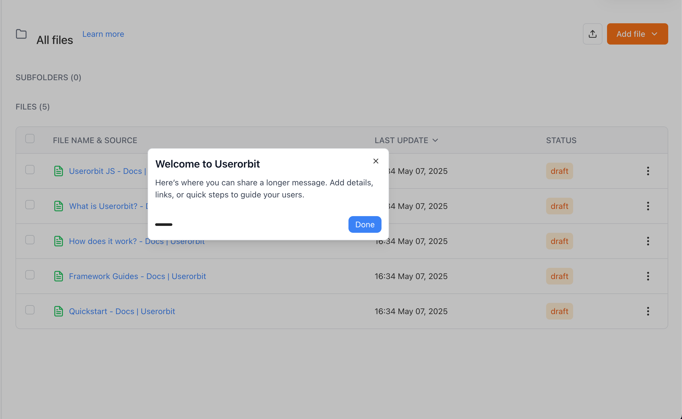
Wrapping Up
Understanding product tour types and step types empowers you to create engaging, effective user experiences.
Key insights:
✨ Tour-level types (Tour, Slideout, Banner) set overall experience
✨ Step-level types (Dialog, Pointer, Banner) can be mixed within one tour
✨ Positioning matters: Center vs corners vs edges changes perception
✨ Match type to purpose: Dialog for attention, Pointer for location, Banner for announcements
✨ Combine for impact: Start Dialog, use Pointers to teach, end with Banner
Quick decision guide:
Need full attention? → Dialog (Center)
Show where something is? → Pointer
Quick announcement? → Banner
Contextual help? → Slideout or Pointer
Multi-step tutorial? → Tour with mixed step types
Key takeaways:
Mix Dialog, Pointer, and Banner steps in one tour
Center modals demand attention, slideouts are less intrusive
Pointers work best with "Auto" positioning
Banners use content justification for layout
Test all types on mobile devices before launching
Remember: The best tour uses the right type for each moment in the user journey. Start strong with Dialog, guide with Pointers, and remind with Banners.
Next steps:
Need help choosing the right tour type? Contact our support team or click the chat bubble below for personalized assistance.
Happy touring! 🚀