Beacons are visual indicators that draw user attention to specific UI elements. They help users discover new features and guide them to important actions without being intrusive.
What are beacons?
Beacons are small, attention-grabbing visual elements that pulse, glow, or display labels to highlight specific features. When clicked, they can trigger a tour step or simply draw attention to an element.
When to use beacons
New feature announcements: Highlight recently launched features
Feature discovery: Draw attention to underutilized features
Guided navigation: Direct users to the next step in a workflow
Persistent hints: Keep important options visible
Benefits
Non-intrusive user guidance
Increases feature discoverability
Reduces support tickets
Works alongside or independently from tours
Beacon types
Userorbit offers three beacon types for different use cases. Each type serves a specific purpose and visual style.
Badge beacons
Small circular indicators with icons and optional text labels. The most versatile beacon type.
Available icons:
ℹ️ Info
Best for: General information, feature explanations, documentation, help guides
Example text: "Info", "i"
✨ Sparkles
Best for: New features, product updates, premium features, highlights
Example text: "New", "Pro"
💡 Lightbulb
Best for: Tips and tricks, best practices, suggestions, insights
Example text: "Tip", "!"
❓ Question
Best for: Help and support, unclear functionality, FAQ links
Example text: "?", "Help"
Common text combinations:
"New" → New features (✨ Sparkles)
"!" → Important tips (💡 Lightbulb)
"?" → Help available (❓ Question)
"i" → Info available (ℹ️ Info)
"Pro" → Premium features (✨ Sparkles)
"1", "2", "3" → Step numbers (Any icon)
"Beta" → Beta features (✨ Sparkles, use "β" for short)
Hotspot beacons
Pulsing circular indicators that draw attention without text. Clean, minimal design.
Best for: Minimal interfaces, subtle attention, small elements, clean aesthetics
Label beacons
Text-based indicators with backgrounds for custom context. Direct messaging approach.
Best for: Custom text needs, clear instructions, step indicators, direct calls-to-action
Beacon positioning
Beacons can be positioned in 13 locations around the target element for maximum flexibility and visibility.
All 13 Beacon Positions
Basic 9 positions:
Top row: Top-left, Top, Top-right
Middle row: Left, Center, Right
Bottom row: Bottom-left, Bottom, Bottom-right
Additional 4 positions:
Center-left: Left of center
Center-right: Right of center
Center-top: Above center
Center-bottom: Below center
Position Selection Guide
Quick selection guide:
Top-right: Default choice (buttons, cards, menu items)
Center: Maximum visibility (large panels, cards)
Right: Clean aesthetic (navigation items)
Top/Bottom: Wide elements, banners
Choosing the Right Position
Recommended positions by element type:
Button → Top-right (Doesn't cover button text)
Icon → Top-right or center (Highlights the icon)
Menu item → Right (Doesn't cover text)
Card → Top-right or center (Visible but not intrusive)
Input field → Top-right (Doesn't block label)
Dropdown → Top-right (Doesn't interfere with expansion)
Large panel → Center (Maximum visibility)
Navigation item → Right (Clean, clear indicator)
Header element → Bottom-right (Stands out from content)
Footer element → Top-right (Above the element)
Position Best Practices
Do:
Start with top-right as default
Test on different screen sizes
Use center positions for large, important elements
Consider what users click on - don't block clickable areas
Don't:
Block the element's primary function
Place too close to screen edge
Use center on tiny elements
Position over text user needs to read
Mobile Positioning Considerations
Recommended mobile positions:
Top-right (still works well)
Center (more reliable on small screens)
Avoid extreme edge positions
Configuring beacons
To add a beacon to your tour step, follow these configuration steps:
Step 1: Enable beacons
Create or edit a tour step
Navigate to Behavior tab
Select type as Pointer/Tooltip
Toggle "Show beacon" to enable
Step 2: Choose beacon type
Badge: Circular icon with optional text
Best for: Feature highlights, new badges, tips
Hotspot: Pulsing circle indicator
Best for: Minimal design, subtle hints
Label: Text label with optional icon
Best for: Descriptive hints, custom messages
Step 3: Set position
Position dropdown options:
Basic 9 positions:
Top row: Top-left, Top, Top-right
Middle row: Left, Center, Right
Bottom row: Bottom-left, Bottom, Bottom-right
Additional 4 positions:
Center-left: Left of center
Center-right: Right of center
Center-top: Above center
Center-bottom: Below center
Total: 13 position options available
Step 4: Customize appearance
Configuration options vary by beacon type:
Badge Beacons
Icon selection: Info (ℹ️), Sparkles (✨), Lightbulb (💡), Question (❓)
Badge text (optional): 1-4 characters - Examples: "New", "!", "?", "Pro"
Colors: Badge background and text color with WCAG AA compliance
Hotspot Beacons
Beacon background: Single color selection that will pulse to draw attention
Label Beacons
Label text: Main message (2-5 words recommended)
Badge text (optional): Short prefix (1-4 characters)
Icon selection: Same as badge beacons
Colors: Badge and label background/text colors
Step 5: Configure behavior
Show Step with Beacon
When enabled (default): Clicking beacon opens the tour step
When disabled: Beacon is display-only, tour step shows automatically
Beacon Click Action
Open tour step (default): Shows the associated tooltip
Navigate to URL: Opens a link when beacon is clicked
Trigger custom event: Fires JavaScript event for analytics
Do nothing: Beacon is non-interactive
Step 6: Test the beacon
Before publishing:
Preview the tour in the builder
Check beacon visibility on the target element
Test beacon click behavior
Verify positioning on different screen sizes
Test on mobile devices
Advanced: Multiple Beacons
Best practices for multiple beacons:
Limit to 2-3 visible at once (avoid clutter)
Use different positions to spread them out
Use consistent icon meanings
Remove old beacons before adding new ones
Styling beacons
Customize appearance to match your brand:
Badge background: Fill color for badge beacons
Badge text: Text color for readability
Beacon background: Background for hotspots and labels
Badge radius: Corner roundness (0 = square, high = circular)
Best practices:
Use brand colors for consistency
Ensure WCAG AA contrast (minimum 4.5:1)
Test on light and dark backgrounds
Best practices
Do's
Limit to 1-3 visible beacons at once
Match your brand colors
Make them actionable
Remove after feature adoption
Use sparkles for new features
Use question mark for help
Don'ts
Too many beacons create visual noise
Don't use for critical info (can be missed)
Don't cover important UI
Don't make them permanent
Combining with tour steps
Progressive disclosure pattern:
Beacon appears → draws attention
User clicks beacon → opens tour step
Tour educates → provides context
Beacon disappears → after engagement
Use cases
1. New feature announcement
Beacon setup: Badge type, "New" label, Top-right position, Opens tour
2. Onboarding assistance
Beacon setup: Hotspot type, Center position, Opens profile completion tour
3. Pro feature promotion
Beacon setup: Label type, "Pro" text, Sparkles icon, Opens upgrade prompt
4. Help and support
Beacon setup: Badge type, "?" text, Question icon, Opens help tour
Troubleshooting
Beacon not appearing:
Verify element selector in DevTools
Check if beacons are enabled in tour settings
Add delay before showing
Beacon in wrong position:
Choose different position option
Test on various screen sizes
Beacon click not working:
Check browser console for errors
Verify tour configuration
Check click action settings
Complete Beacon Configuration Examples
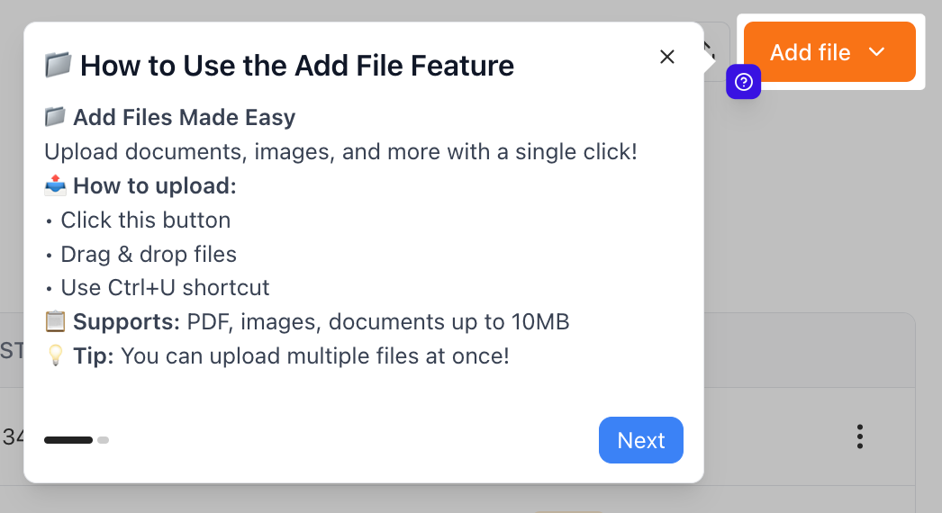
Example 1: New Feature Announcement

Badge beacon with sparkles icon highlighting a dashboard feature.
Example 2: Contextual Help
Question badge positioned to provide contextual help for complex settings.
Beacon Analytics and Optimization
Tracking Beacon Effectiveness
Monitor these metrics to optimize beacon performance:
Key metrics:
Beacon click-through rate
Tour completion rate from beacon clicks
Feature adoption after beacon interaction
Time to first click
When to Remove Beacons
Remove "New" beacons when:
Feature is no longer new (2-4 weeks typically)
Adoption reaches target threshold
Next "new" feature launches
Keep persistent beacons for:
Complex features that always need help
Premium features requiring upgrade
Wrapping Up
Beacons are powerful tools for drawing attention and guiding feature discovery. Use them strategically - start with 1-2 well-placed beacons and expand based on user behavior.
Key takeaways:
13 positions give you complete flexibility for any element
3 beacon types (badge, hotspot, label) match different use cases
4 icon types (info, sparkles, lightbulb, question) convey meaning
Customizable behavior controls click actions and step display
Test positioning on all screen sizes before publishing
Remember: Effective beacon usage is about balance. Too few, and users miss features. Too many, and they create noise.
Best practices recap:
Use top-right as default position (works for most elements)
Match icon to purpose (sparkles = new, lightbulb = tip, question = help)
Keep badge text short (1-4 characters maximum)
Ensure color contrast for accessibility (WCAG AA: 4.5:1)
Limit to 2-3 visible beacons at once
Remove "New" badges after feature adoption
Test on mobile devices and small screens
Use consistent icon meanings across your app
Next steps:
Want to track beacon effectiveness? Check out our product tour analytics guide!
Need more help? Contact our support team or click on the chat bubble below for personalized assistance.
Happy beaconing! ✨